Henry Moore Artwork Catalogue
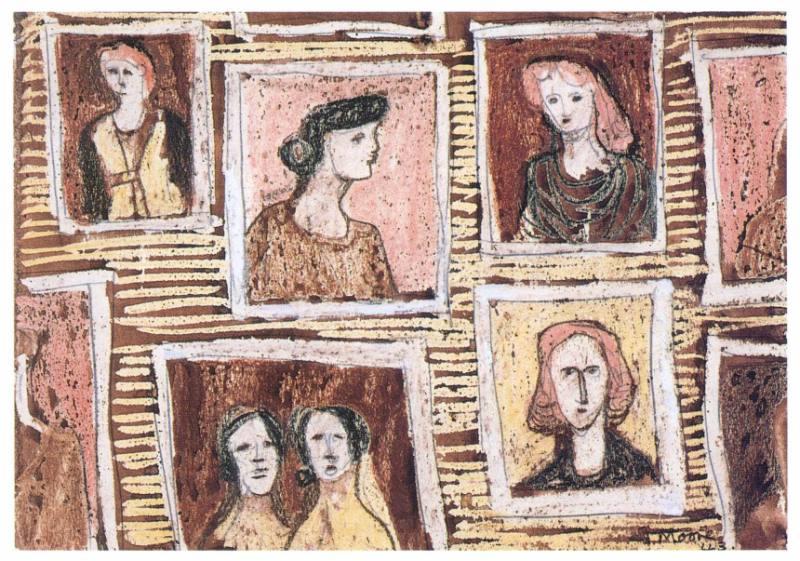
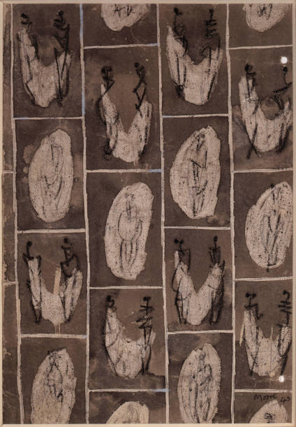
Textile Design: Framed Heads
Textile Design: Framed Heads
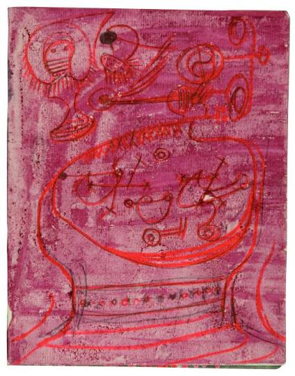
- Page from Textile Design Sketchbook 2
wax crayon l.r. Moore/43
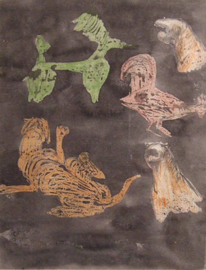
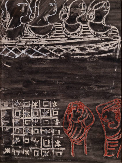
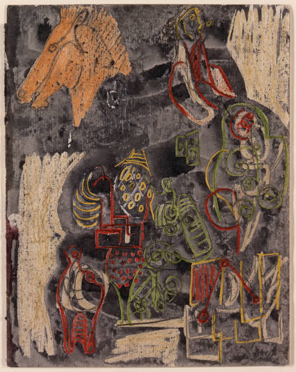
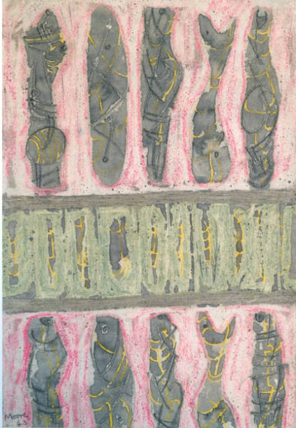
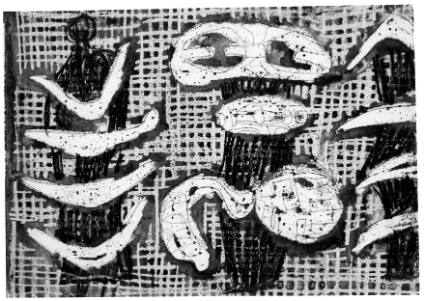
Page from Textile Design Sketchbook 2. In 1942 a Czech émigré named Zika Ascher set up a small textile business in London. During the 1940s, he commissioned leading modern artists, including Moore, to design a range of headscarves to enliven the post-war wardrobe.
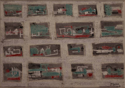
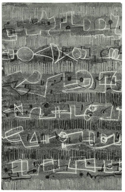
The war had not yet ended when Moore began drawing ideas for textile designs but his vibrant and imaginative creations seem to anticipate a more optimistic future. In 1943, he filled four sketchbooks with ideas incorporating an array of bizarre yet familiar motifs including boomerangs, barbed wire, piano keys, caterpillars, safety pins, insect wings, trains and treble clefs. Many are rendered in brilliant, uninhibited, technicolour, verging on the psychedelic - bright pink, acid green, lemon yellow. This startling use of colour may seem unusual in Moore’s oeuvre but it is not without precedent. In many of his wartime drawings, Moore used starkly contrasting colours to intensify scenes of human misery and devastation. In the textile designs, however, Moore’s use of colour seems particularly exuberant.
Relatively few of Moore’s textile designs went into production but around thirty were made into headscarves, wall hangings and fabrics for fashion and furnishing. Irina even made some curtains for Hoglands from the striking 1944-45 Horse’s Head and Boomerang fabric, an act in keeping with Moore’s belief that art should be a part of everyday life.
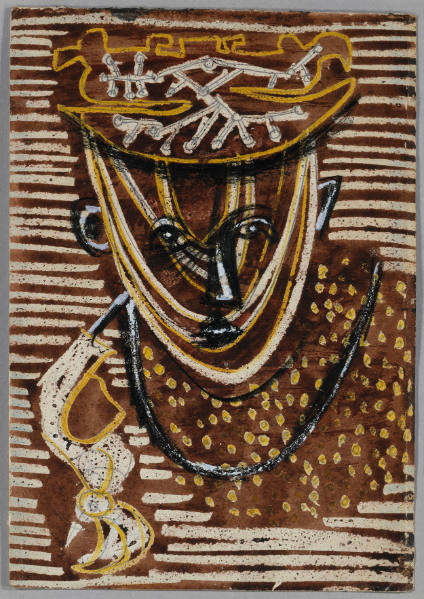
Textile Design: Framed Heads, 1943, was not produced as an Ascher fabric. In 2017, however, over seventy years after its creation, the design featured prominently in a Moore-inspired collection by the British fashion house, Burberry. Dresses, shirts and rucksacks reveal Moore’s understanding of the medium he was designing for. The concept works well in repeat, the horizontal yellow stripes unify the composition while creating a pleasing contrast to the simple blocks of colour behind the framed figures. The graphic design is balanced by the bold yet limited palette of black, pink and yellow, set against a rich brown background....Sylvia Cox 2019

